Tooltips, popovers and modal windows are great for clarifying certain words or showing additional information in context without taking up too much screen space at once.
You can use tooltips, popovers and modal window elements on any page. They can not be used in emails.
Tooltips
Use tooltips to show a short text to respondents when they hover over a word or icon.
Use popovers to show a longer text, or when you want to have a link to an external web page. It is shown when the respondent clicks on a word or icon. The window remains visible until they click again outside of the popover.
Modal Windows
Use modal windows to display a long text, images and links. This creates an overlay that covers a large part of the screen. The background becomes darker so that the focus lies on the window. Respondents click on the X in the top-right corner or outside of the modal window to close it.
Modal title
...
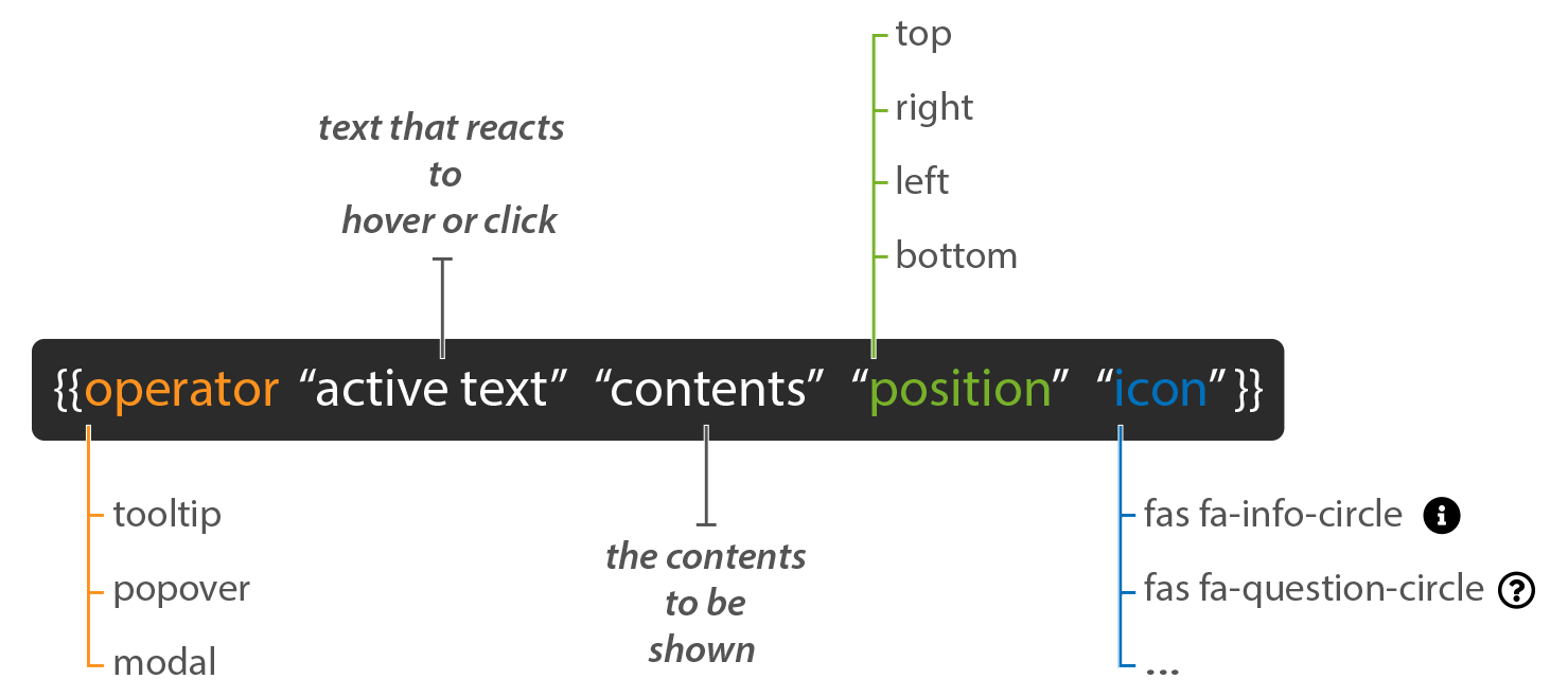
Syntax
Operator: determine what you want to use a 1) tooltip, 2) popover or 3) modal window.
Active text: this is the text that reacts to either the hover or click. Leave the space between the double quotes empty when you only want to display an icon.
Contents: this is the content that will be shown in the tooltip, popover or modal window.
Position (optional): use a position to determine where the contents must be shown (only for tooltips and popovers).
Icon (optional): show an icon as trigger instead of text.