Branding-Style

Guidelines to help create a consistent voice across all platforms who promote the international economic development of Ontario.

In the new global economy, technology and innovation have become increasingly important to the success of business in every sector. Despite a vibrant innovation ecosystem, Ontario isn’t known or considered for high-knowledge, tech-driven investments. We want to change this image.


Graphic titles

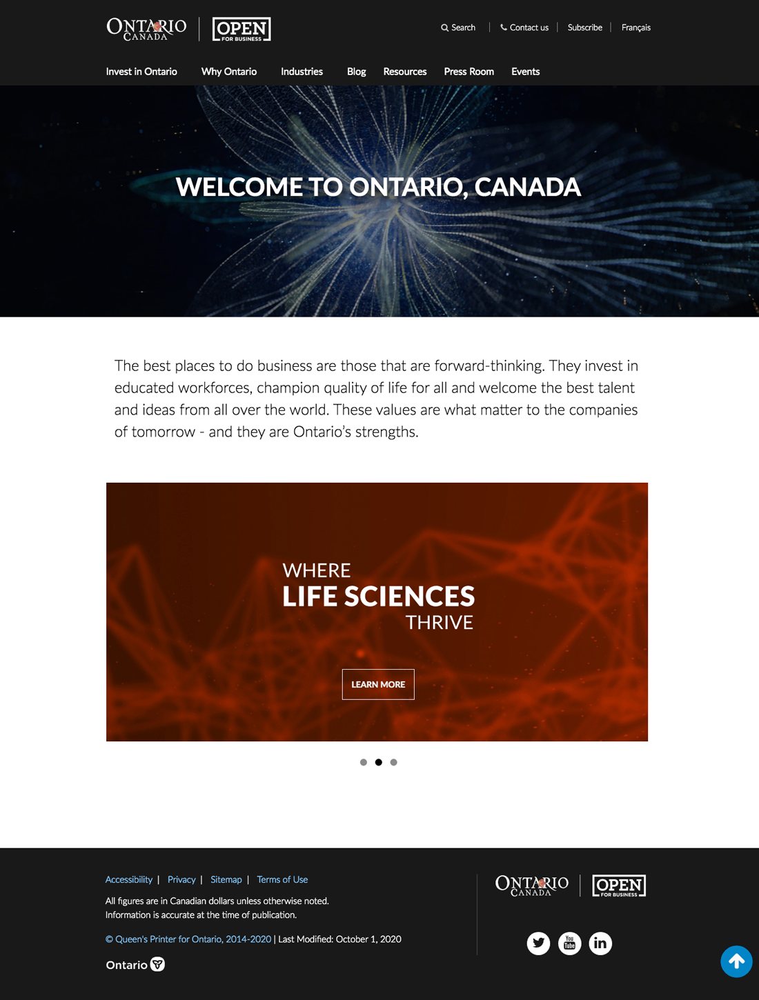
Sector illustrations were developed to provide dynamic backgrounds that enhance our messaging.

They are each inspired by different technology platforms, but not meant to represent the specifics of any particular industry. This provides a flexibility that allows each of the illustrations to cover a different set of sectors/industries that Ontario is proud of.

Each of the graphic title headers include an image mixed with a sector illustration. Named after their respective sectors, the six illustrations are:

  1. Dark Blue: Aerospace, Automotive
  2. Teal: Chemical and Biochemical, Cleantech, Forestry
  3. Deep Green: Financial Services, Mining
  4. Purple: Food and Beverage Manufacturing, Tourism
  5. Fuchsia: Industrial Automation and Robotics, Information Technology
  6. Burnt Orange: Life Sciences

Download the industry image backgrounds here

To view the full width industry illustration, select a thumbnail of any image grouped below.

Dark Blue: Aerospace, Automotive1
Teal: Chemical and Biochemical, Cleantech, Forestry2
Deep Green: Financial Services, Mining3
Purple: Food and Beverage Manufacturing, Tourism4
Fuchsia: Industrial Automation and Robotics, Information Technology5
Burnt Orange: Life Sciences6
×

Logo

Our logos are the foundation and anchor of our brand, acting as a visual cue that creates an instant connection with our audience. It is important to maintain their integrity in all applications to ensure brand consistency.

The online version of the international identifier has been enhanced for accessibility. The raster leaf has been converted to a vector and given a drop shadow for better readability on the web. The logo must stand as a clear and legible element, free from any visual clutter or distractions. With the exception of bilingual applications, do not separate or alter the logo in any way.

The international identifier

International logo

Logo elements has three components: word ‘Ontario’, the word ‘Canada’ and a red maple leaf. Together, they reinforce the association between Ontario and Canada.

The Open for Business icon will reinforce and build connections across government to create an environment where businesses can grow and thrive with ease in Ontario.

Primary Lock-up

Use the primary or reversed logo on backgrounds that offer maximum contrast and legibility. Ensure that the background colours do not blend with the colours of the leaf.

  • Primary logo with light-coloured solid, for use on photographic or illustrated backgrounds.
  • Reverse logo with dark-coloured solid, for use on photographic or illustrated backgrounds.
  • SVG Vector leaf versions for OFB Theme online logos for both primary and reverse use.
    • Using SVG's have their own set of specific browser support.
    • Essentially: it works everywhere except IE 8 and down and Android 2.3 and down.
    • Logo Invert images are not yet able to be applied without a fallback image.
International logo International logo French

Branded pages

When Brand and Logo meet

Invest in Ontario homepage

Invest in Ontario

Source from Ontario homepage

Source from Ontario